Kombinat was employed to design visuals and organize promotional activities for Student Day Festival (SDF) that took place on 29. and 30. 5., and was organized by Student Council of University of Rijeka and RIKUP. With 20 000 students both from University of Rijeka and elsewhere participating, SDF is one of the most relevant student events in Croatia. This year was no exception, with SDF offering a diverse program formed into a specific urban festival. The headliners of this year’s festival were SIGMA, Let 3, Psihomodo Pop, Hladno pivo, Pipschips & Videoclips, Gretta, Aril Brikha and Alexander Kowalski.
The choice of materials, design, illustrations and promotion were the result of a communication plan that emphasized the image of young urban populations taking over the industrial spaces. Given the diverse target audiences due to the program’s diversity (music, culture and sport), the motto of the festival was music. arts. activity, in order to bring together all the various aspects of the festival into a single whole. The timeline for key messaging was defined, and two press conferences were organized.
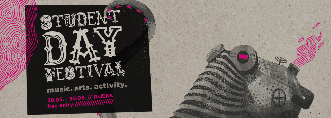
In order to give the festival a singular visual “flavour”, we designed an illustration of a mechanical octopussy – the so -called detonator of urban personality that uses its tentacles to connect the different aspects of the festival. The animal character of octopussy was chosen due to it being an unusually intelligent sea animal, which uses cunning methods in the hunt and looks for food only when it gets dark. All those identifications could refer to students that, after a semestre of hard work, go out at night to look for fun times.
Warm grey and pink were chosen for the octopussy; the industrial dirty mechanism of the octopussy with strong magenta touches. For the sense of a well-oiled, powerful, dynamic, but also warm machine, the layered aesthetics reminiscent of steampunk were used.
Due to the large amount of information on the materials, a static, cold and readable typography was used. The visuals featured the same style of communication, emphasizing the tentacles and in that way pointing out the program’s variety. Hard-copy materials included: accreditations, posters, billboard, brochure, t-shirts, guerilla stickers (tentacles), festival materials (banners, thank-you-notes, VJ materials); while online materials included: custom made posts, “best SDF photo” app and radio jingle. For the first time, pocket brochure with program was printed, and the designer Juraj Zigman designed t-shirts with parts of a mechanical octopussy.
The immense visibility of the festival is a result of combined strenghts: the strong visuals of the mecha-octopussy in all the materials, well-thought-out PR, and the strategic positioning of the festival and its various aspects. These gave the festival its recognizability, they developed a dynamic communication with the target audiences as well as the general public, brought the sense of synergy to the project, and in the end, brought a larger amount of visitors to the festival, making them feel like a part of something they want to visit again.
Radio jingle /// Concept and text: Kombinat /// Production: Soundset Trsat
Media response to the project
novilist.hr/1
novilist.hr/2
novilist.hr/3
novilist.hr/4
novilist.hr/5
novilist.hr/6
hrt.hr
radio.hrt.hr/1
radio.hrt.hr/2
rijeka.hr
mojarijeka.hr/1
mojarijeka.hr/2
mojarijeka.hr/3
fiuman.hr/1
fiuman.hr/2
fiuman.hr/3
fiuman.hr/4
/// KombiCut ///
An attack of media plans! POW! POW! POW!

